Container Widgets
Group
A group is a container that can hold any number of widgets.
Group {
    title: "Group Title"

    // Any number of widgets
}
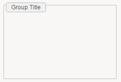
Required attributes are marked in bold.
title the title to be displayed if needed
border True/False indicates if a border should be displayed or not. Note that if a title is given then a border will always exists.
Supports the common attributes: feature , layout, mixins, margins, background and hidden.
ConditionalGroup
Conditional group allows to display a group based on the value of variables, parameters or record columns.
A conditional group looks just like a normal group and share the same attributes. The different is that the widgets inside can change depending on a condition.
ConditionalGroup {
  title: "Group Title"

  StringCondition (selectedIdentityUid){
    when IsEmpty then [
      // Any number of widgets to show when the variable is empty

    ]
    otherwise [
      // Any number of widgets to show otherwise
    ]
  }
}

Required attributes are marked in bold
title the title to be displayed if needed
border True/False indicates if a border should be displayed or not. Note that if a title is given then a border will always exists.
Supports the common attributes: feature , layout, mixins, margins , background and hidden.
4 Condition structures are supported depending of the variable type, their syntax is very similar to the corresponding Predicate Functions:
StringCondition ( variable ) {
    when "value" then [
        //widgets
    ]
    when IsEmpty then [
        //widgets
    ]
    otherwise then [
        //widgets
    ]
}
Used to test String variables, many conditions are supported and tested in order. An otherwise condition can be used at the end.
IntCondition ( variable ) {
    when InvalidInteger then [
        //widgets
    ]
    when = 0 then [
        //widgets
    ]
    when < 10 then [
        //widgets
    ]
    otherwise [
        //widgets
    ]
}
Used to test Int variables, many conditions are supported and tested in order. An otherwise condition can be used at the end.
BooleanCondition ( bol) {
 when False then [
 //widgets
 ]
 when True then [
         //widgets
 ]
}
Used to test boolean variables, only 2 conditions are supported True or False.
DateCondition ( variable ) {
    when DateAfter DateLDAP(date) then [
        //widgets
    ]
    otherwise [
        //widgets
    ]
}
Used to test Date variables, many conditions are supported and tested in order. An otherwise condition can be used at the end.
As for the DatePredicate the supported keywords are: DateAfter, DateBefore, DateBetween, TimeAfter, TimeBefore, TimeBetween.
Grid
Grid is an structure of rows and columns to organize and contain other widgets in cells.
For a grid the most important is to declare how many columns it will have. We need to declare them in the required columns attribute
Grid {
 columns: GridColumn { width: 50 } , GridColumn { width: 50 }
 gap: 10

 GridRow {
 GridCell{
 background: Color gray
 // Cell for row 1 , col 1
 // Any number of widgets
 }
 GridCell{
 background: Color grey
 // Cell for row 1 , col 2
 // Any number of widgets
 }
 }
 GridRow{
 GridCell{
 background: Color gray
 // Cell for row 2 , col 1
 // Any number of widgets
 }
 GridCell{
 background: Color gray
 // Cell for row 2 , col 2
 // Any number of widgets
 }
 }
}
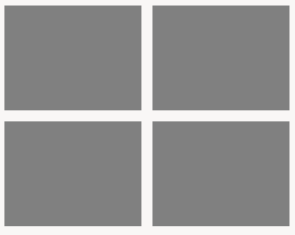
Required attributes are marked in bold:
columns declare the columns , and optionally their size in pixels or set them to grow to take as much as possible. syntax is GridColumn {} or GridColumn {width: 100} or GridColumn { width: grow}
many columns can be declared separated with ',' and in order: GridColumn { width: 50 } , GridColumn { width: grow }
gap is the size in pixels to have between cells
insets size in pixels of the margin inside the cells
fill allows the grid to fill the available space using keywords: None, Horizontal, Vertical, Both
Supports the common attributes: feature , layout, mixins, background and hidden.
In order to define the structure of the grid , it will take different kind of objects: GridRow , GridCell:
Grid
GridRow
GridCells ( one per column)
Can contain any number of widgets
GridRow
GridCells ( one per column)
Can contain any number of widgets
GridRow Attributes:
height declares the height of all the row in pixels
GridCells Attributes:
span declares the number of cells that it will take. if 2, it will take the space of 2 cells
Flow
Flow is a transparent container. It can only contain a limited number of supported widgets and it allows to chose the disposition of the widgets.
Supported Widgets:
Group, ConditionalGroup, Flow, Grid, Splitter, TabFolder and Tiles.
Flow {
 disposition: Horizontal

 Group {
 title: "Group1"
 }
 Group {
 title: "Group2"
 }
}
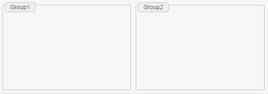
Required attributes are marked in bold
disposition it defines the disposition of the subcontainers. options are Horizontal or Vertical.
Supports the common attributes: feature , layout, mixins, background and hidden.
TabFolder
TabFolder is a container that holds widgets in form of tabs.
TabFolder {
 position: Top

 TabItem {
 text: "Tab 1"
 // Any number of widgets
 }
 TabItem {
 text: "Tab 2"
 // Any number of widgets
 }
}
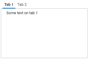
Required attributes are marked in bold
position defines if the tabs are positioned at the top or at the bottom. Options are Top or Bottom
Supports the common attributes: feature , layout, mixins, background and hidden.
To organize the widgets in tabs , we use the TabItem object
TabFolder
TabItem
Can contain any number of widgets
TabItem Attributes
text describe the text display on the tab
icon path to an icon displayed on the tab (e.g. "16/famfamfam_silk_icons_v013/accept.png"))
Note: the path for icons is relative to ProjectFolder/reports/icons
hidden dynamic boolean expression that controls whether the tab item is visible or hidden in the parent tab folder.
If an active tab item becomes hidden, then the next visible tab starting from the left will be selected.
Moreover, you must ensure that at least one tab item is visible at any time.
Example:
TabItem {
  hidden: Eval " nbPermissions > 0 "
}
Splitter
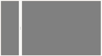
Splitter is a container that split the area in two pieces. It can be done Horizontally or Vertically. It requires an initial size but it can be resized by the user.
An splitter can only hold 2 other containers:
Group, ConditionalGroup, Flow, Grid, Splitter, TabFolder and Tiles
Splitter {
 disposition: Horizontal
 size: 20%

 Group {
 background: Color gray
 }

 Group
 {
 background: Color gray
 }
}
Required attributes are marked in bold
disposition defines the disposition of the splitter, it can be : Horizontal or Vertical
size defines the initial size of the first group, it can be a percentage or pixels ( eg 20% or 20px).
Supports the common attributes: feature , layout, mixins, background and hidden.
Tiles
Tiles is a container that hold sub-containers of type Tile.
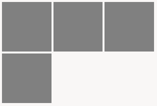
A Tile is a container with a fixed height , that are organized in columns.
We can have any number of Tile elements that will be positioned next to each other in next available column.
If no more columns are available the next Tile will be positioned in a new row:
Tiles {
 columns: 3
 tile-height: 100

 Tile {
 background: Color gray
 // Any number of widgets
 }
 Tile {
 background: Color gray
 // Any number of widgets
 }
 Tile {
 background: Color gray
 // Any number of widgets
 }
 Tile {
 background: Color gray
 // Any number of widgets
 }
}
Required attributes are marked in bold
columns the number of columns of tiles
tile-height the number of pixels for the height of each tile
gap number of pixels to customize the space between tiles
insets the number in pixels of the margin inside each tile
align
Supports the common attributes: feature , layout, mixins, background and hidden.
To fill the Tiles object we can use Tile objects:
Tiles
Tile
Can contain any number of widgets
Tile Attributes
Supports the common attributes: feature, hidden